Led the end-to-end web redesign from strategy through launch as Lead Digital Designer at Transfr, aligning a growing VR workforce and K-12 platform with a website that had outgrown its ability to tell the company's powerful mission. Rearchitected the global information architecture, expanded core navigation for new product lines, and modernized the visual identity and design system alongside a five-person cross-functional team.
Want to skip the visual showcase?
Unique pages designed, from homepage to niche industry landing pages
increase in leads in the first month
Series C raised after platform launch
learners reached across 40+ states
Visual & UX Designer
IA · Visual design · Design system · Product pages · Landing pages
· WordPress Developer
Visual/UX Design
Tuly J. (Me)
Art Direction
Ana C.
SEO
Brandon W.
Marketing
Andrew A.
Copy
Jack C.
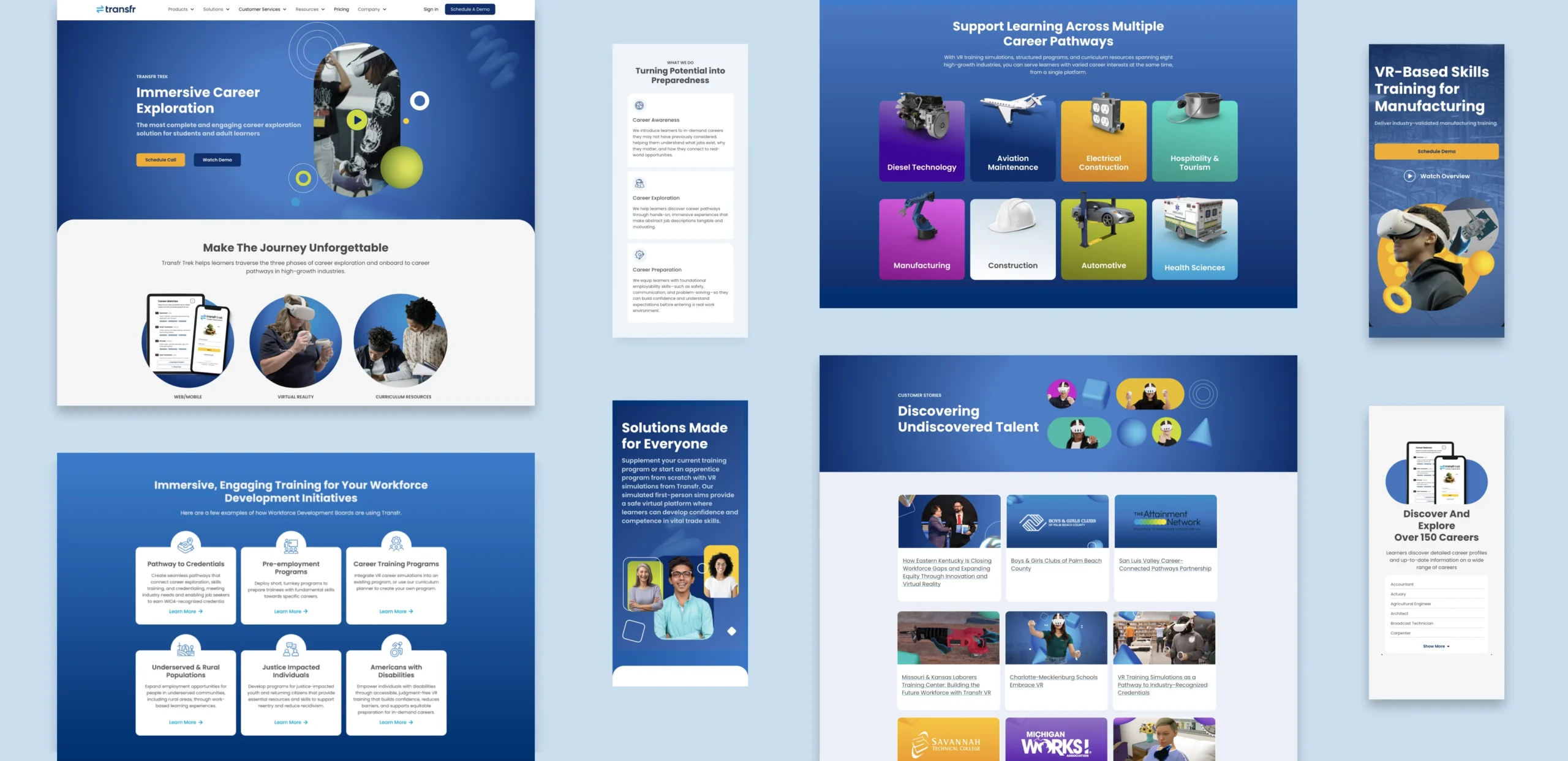
transfrinc.com — designed from the ground up
School districts, workforce boards, correctional facilities, employers, and youth programs were all landing on a single generic page. Add six stakeholders with competing priorities and a tight deadline, and the core challenge shifted from pure design to cross-functional alignment.

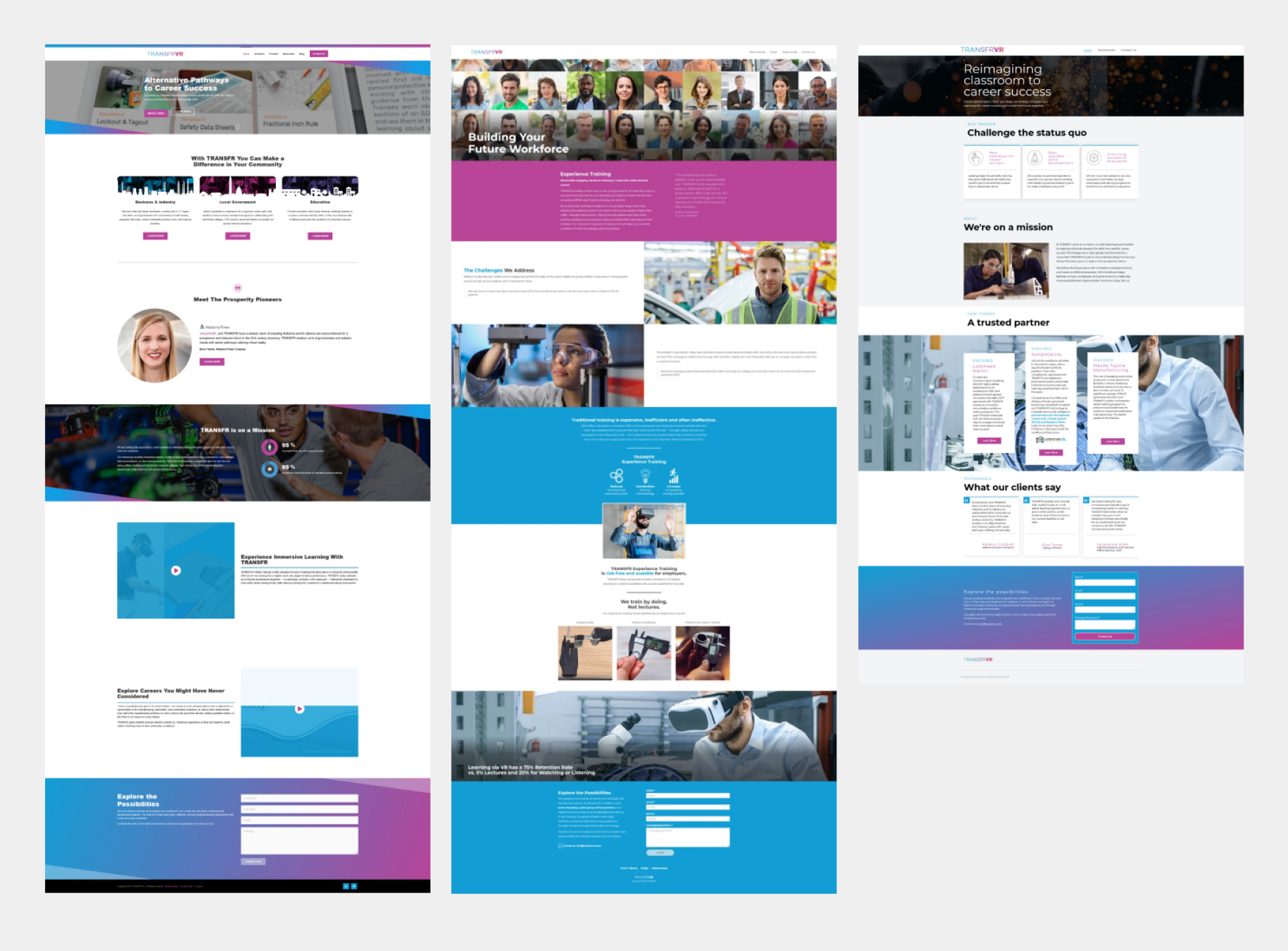
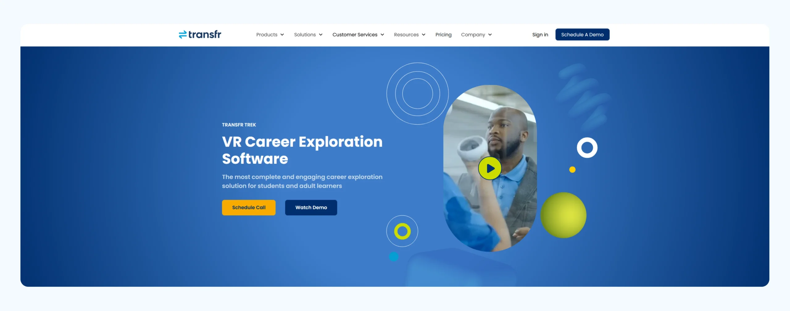
Before: The original site was dated, desktop-centric, and routed all visitors through a single contact form without addressing distinct audience needs
Untangling the Navigation
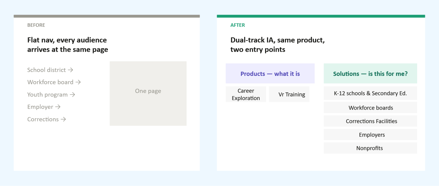
A broken information architecture meant visitors landed and got lost. The solution was a navigation system built around a single strategic distinction: Products (what Transfr offers) versus Solutions (who it is for). Separating the what from the who became the backbone of the site, bringing clarity to every downstream design decision.
To execute this, I audited our existing content and mapped each audience's distinct needs to identify gaps and shape the new structure. I then aligned key stakeholders and worked closely with our product marketer to validate the framework.
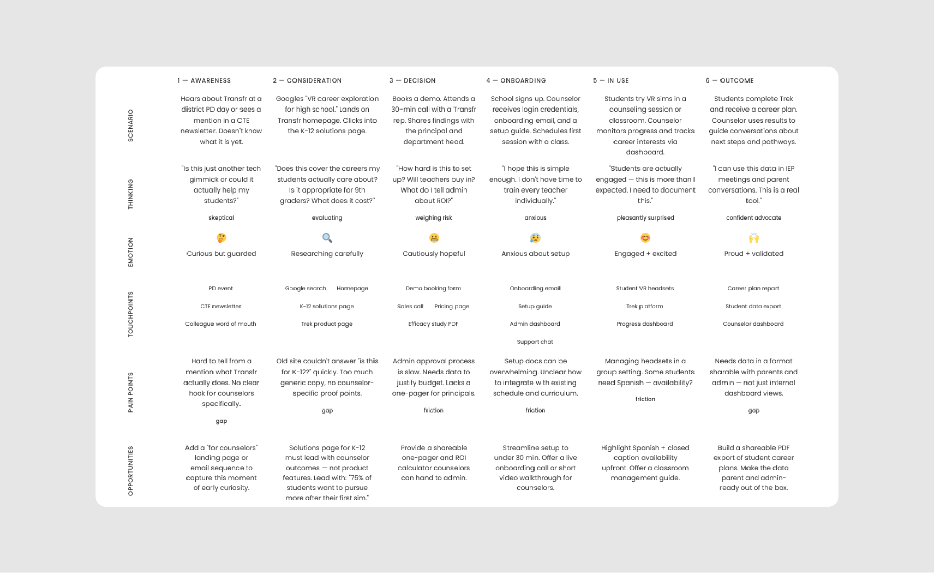
A high school counselor discovers Transfr while looking for interactive career exploration tools to show her students what their futures could look like
Visual System & Brand Language
In close collaboration with my art director, I designed the visual identity across all pages, establishing the typography, color palette, imagery direction, iconography, and component patterns. Transfr serves workforce directors, teachers, and individuals rebuilding careers, so the brand needed to speak directly to people who have doubted the system, not just those running it.
We balanced credibility with warmth. Deep navy grounds the brand in authority, vibrant teal signals momentum, accessible typography ensures clarity, and photography puts real people at the center of the story. To support long-term growth, I built a scalable, reusable component library that allows new industries, solutions, and resources to launch seamlessly without requiring a ground-up redesign.
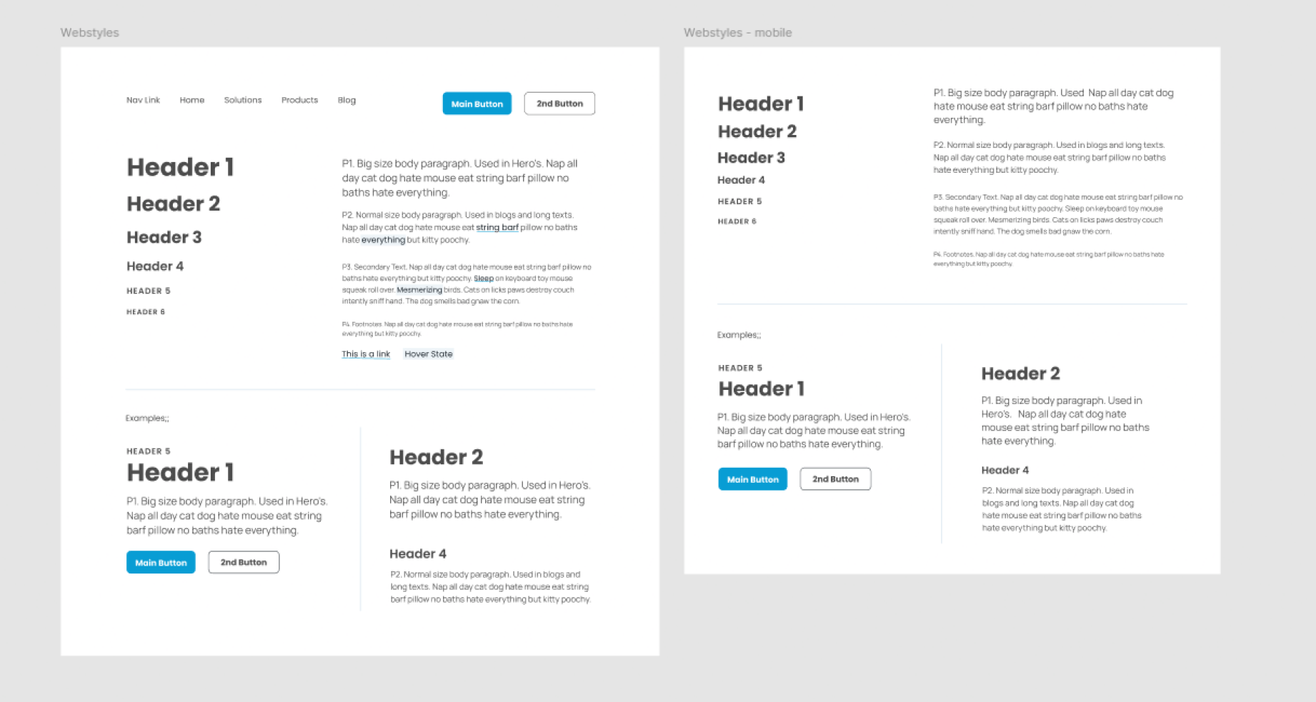
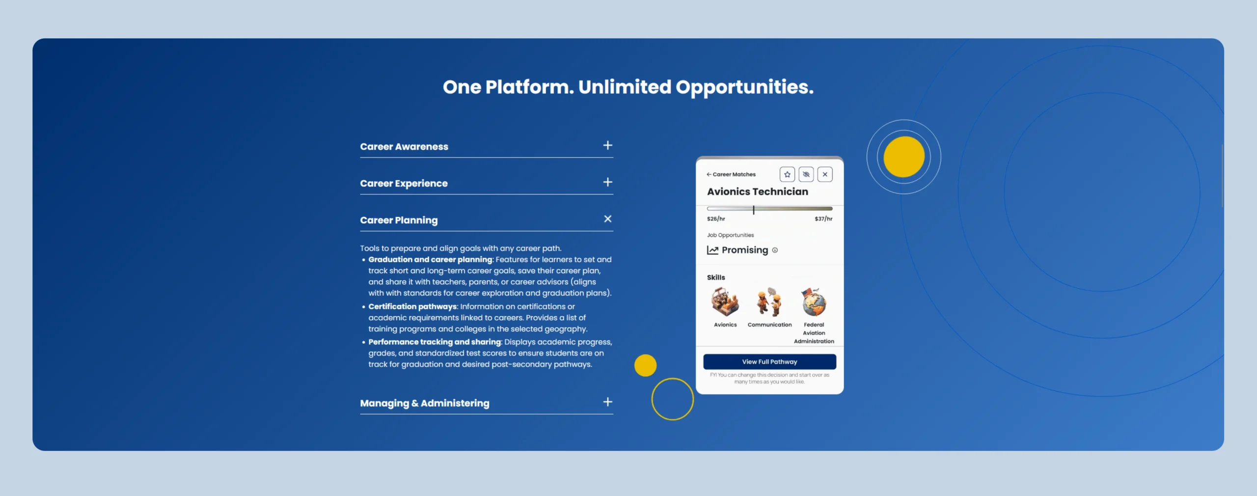
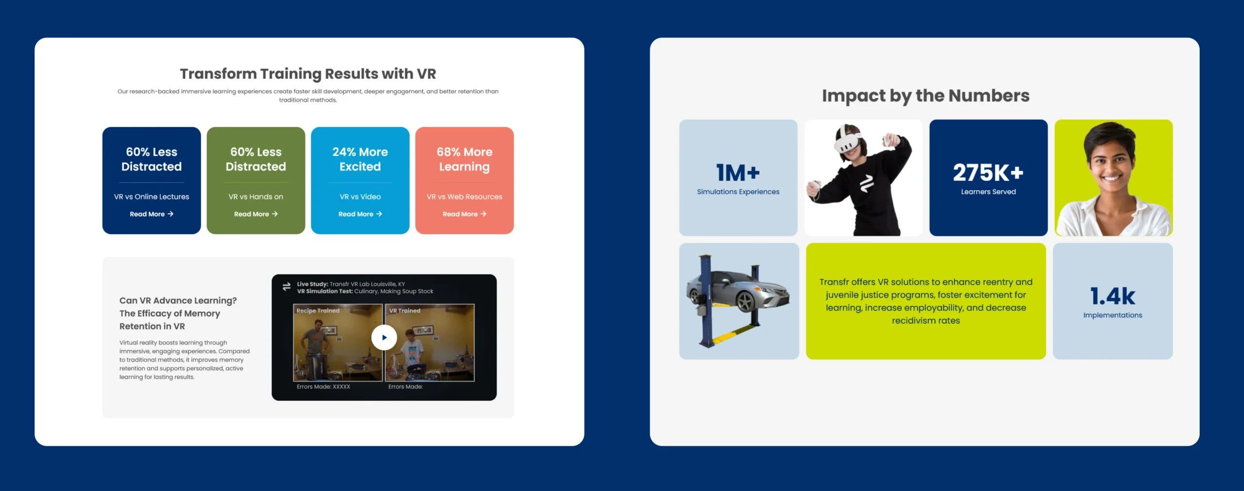
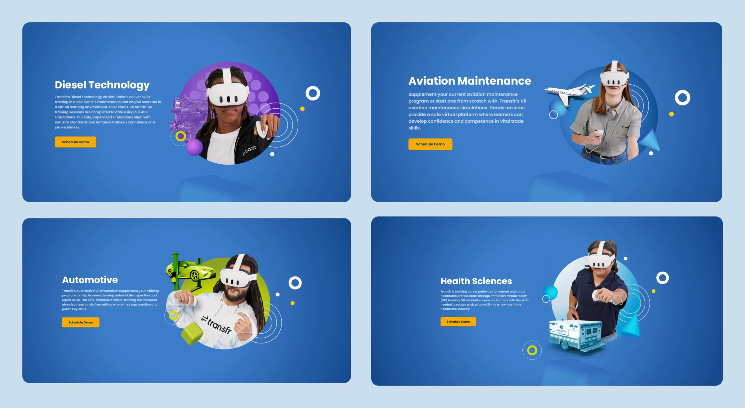
Preview of the visual styles I created for desktop & mobile.
Core Page Templates & Experience
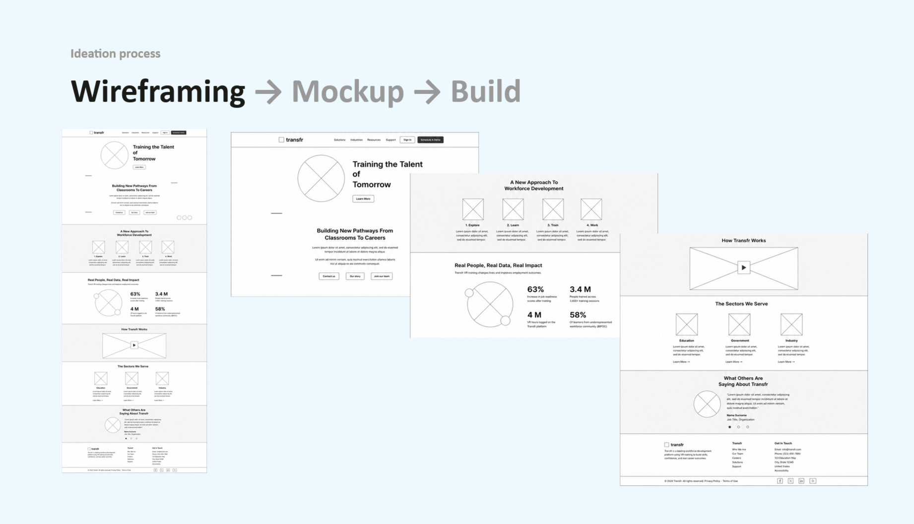
Designed the entire suite of page templates in close collaboration with our product marketer, including the homepage, product overviews for Transfr Trek and Transfr Train, eight industry pages, five solution pages, and a full resource hub. Each layout was tailored around the specific questions and goals of its unique audience. Following the design phase, I built and shipped these pages directly in WordPress alongside our SEO manager.
Transfr clarified why I care deeply about mission-driven work and helped me grow into a stronger systems thinker. The core challenge was not rendering beautiful pages, but architecting a system that could genuinely serve five distinct audiences without making any of them feel like an afterthought.
Establishing the Products versus Solutions split proved that clarity must always precede craft. If users cannot find their path within the first ten seconds, the polish does not matter. That principle remains central to how I approach every system I design.
A Quick Fun Fact: Beyond the main web scope, I dipped into the product side to help our product designer expand the core design system. Before my art director joined, I also shaped Transfr's initial visual and brand direction coming out of a competitive analysis. In fact, our new look was so distinct that a few competitors ended up copying it.

Redesigning for High-Stakes Legibility and WCAG Compliance in AI Gameplay