Led the product redesign of >_Terminal, an AI programming game where engineers compete head-to-head, tower-defense style, for recognition and job opportunities from Citadel Securities. In close collaboration with the Game Designer, Art Director, Front-end Engineer, and PM, I rebuilt the gameboard interface, site architecture, and visual system, turning user retention and accessibility from major liabilities into core strengths.
Want to skip the visual showcase?
increase in user retention
ease-of-use rating (up from 5.3/10)
new game UI elements designed
seasons per year launched with new collateral
Product Designer
Game UI · User Research · Site Architecture · Design System
Product Design
Tuly J. (Me)
Product Manager
Rebecca R.
Game Designer
Junaid N.
Art Director
Juan S.
Engineer
Felix G.
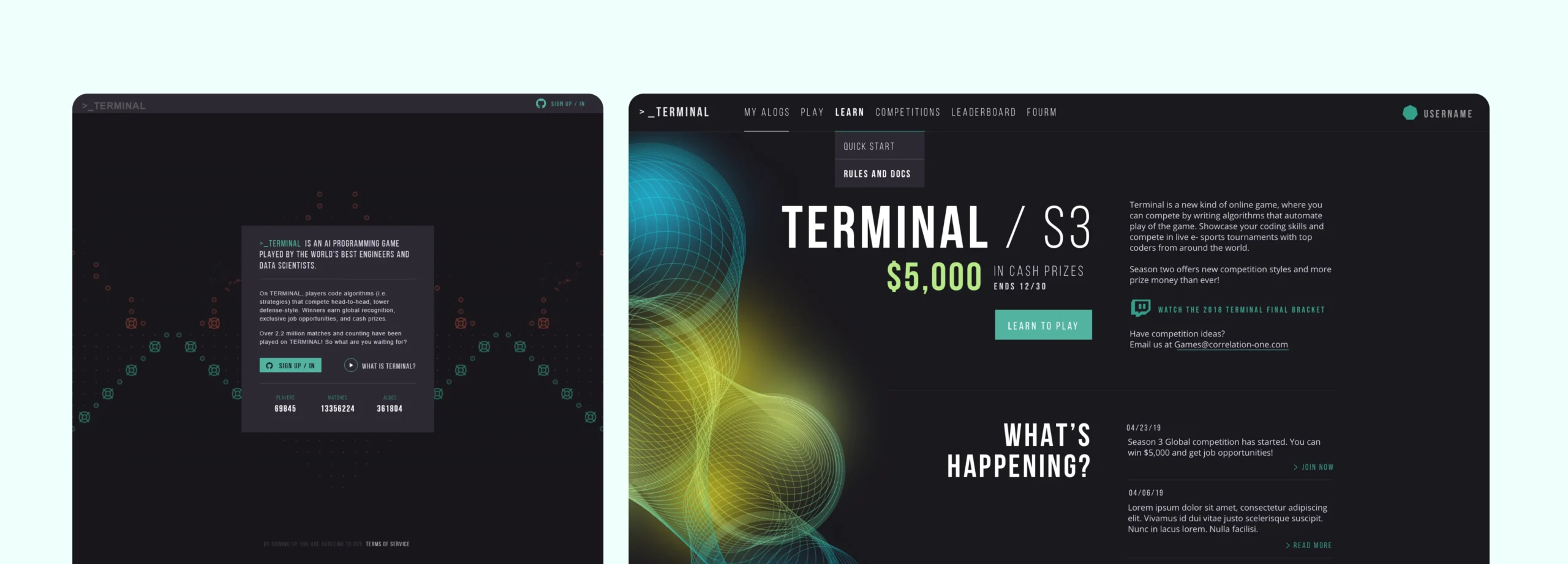
Terminal AI — Logged out & Logged in homepage
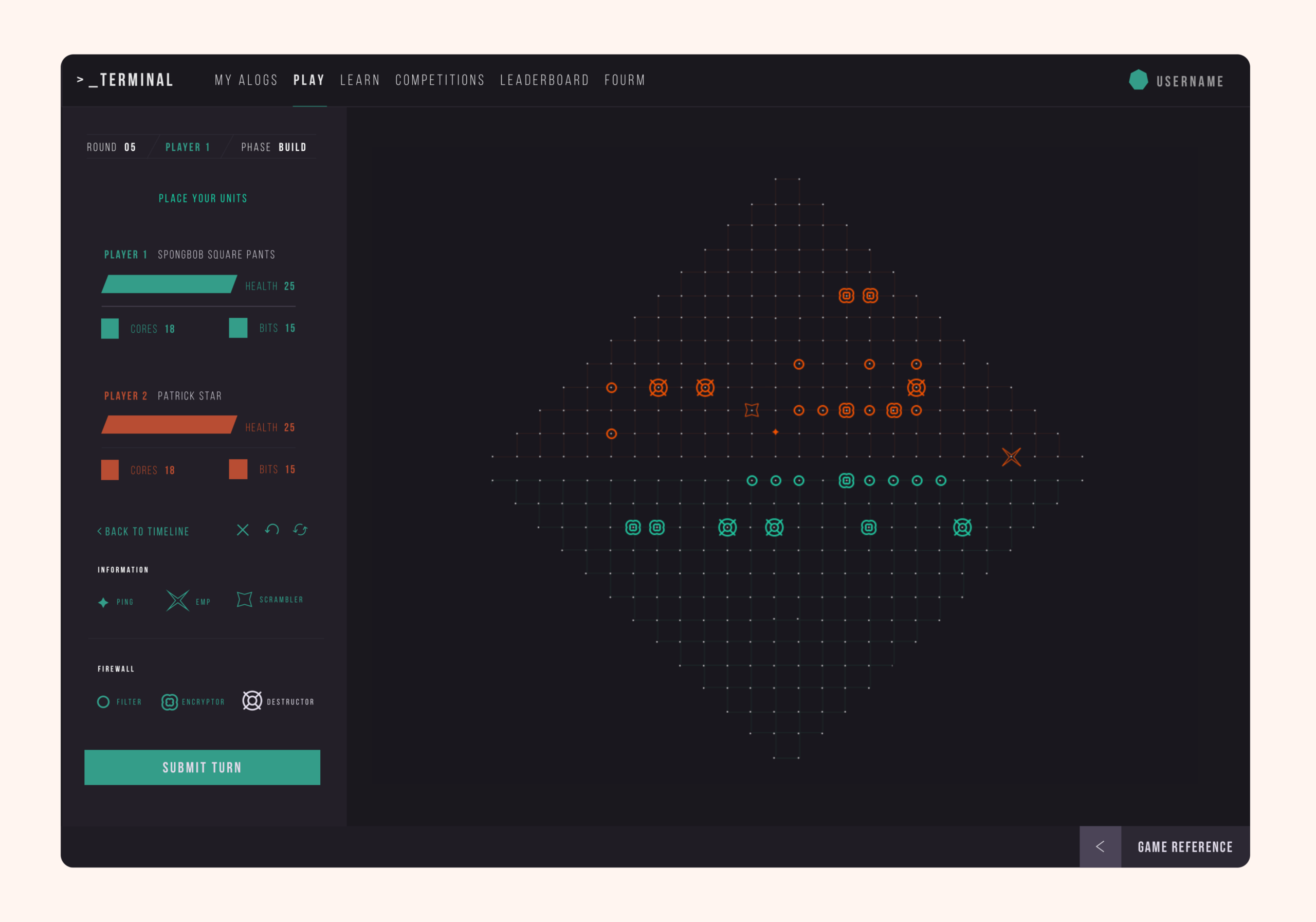
Terminal AI — Gameboard redesigned
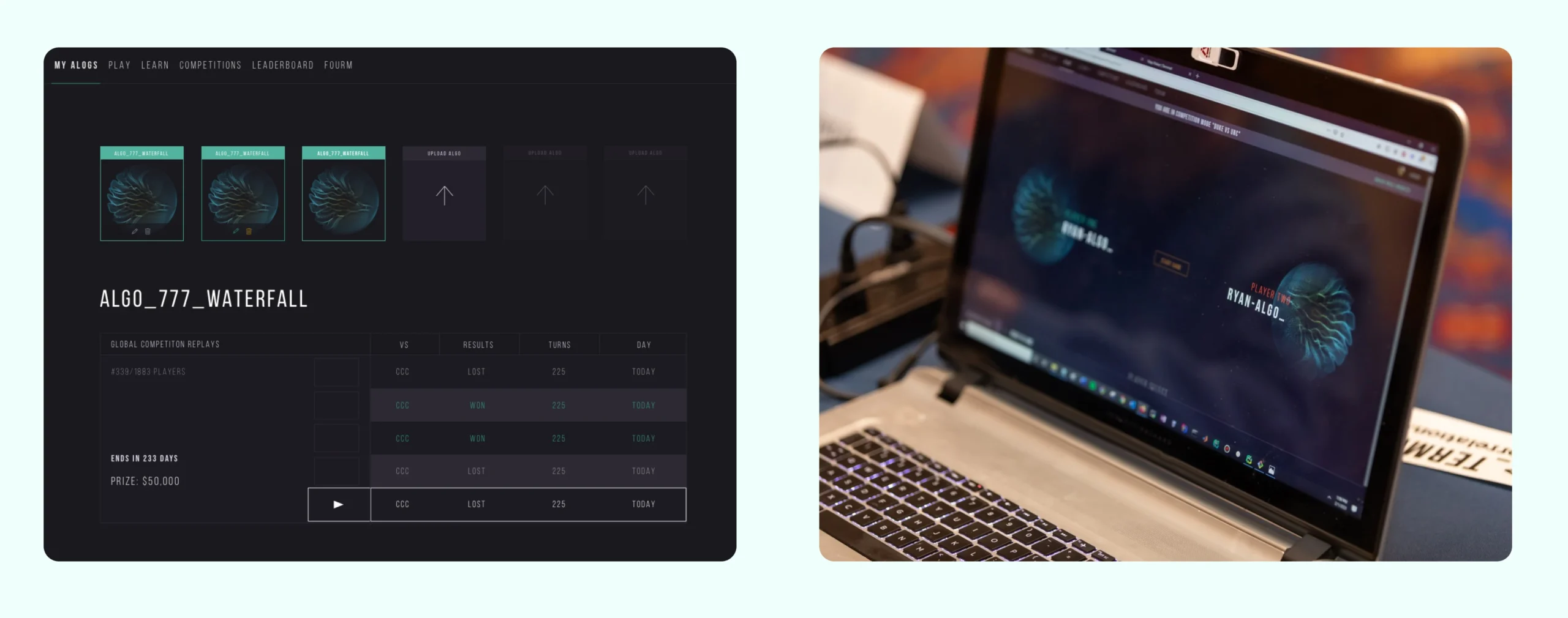
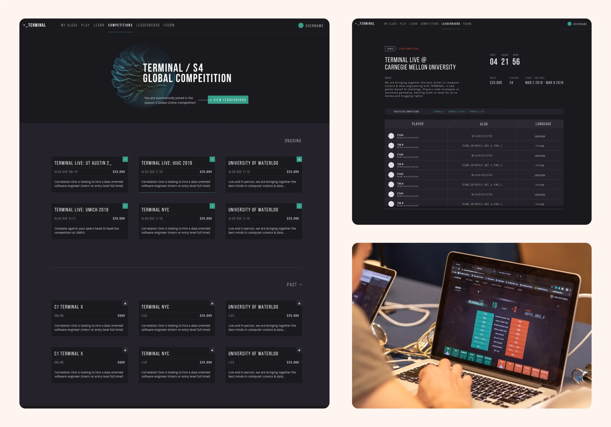
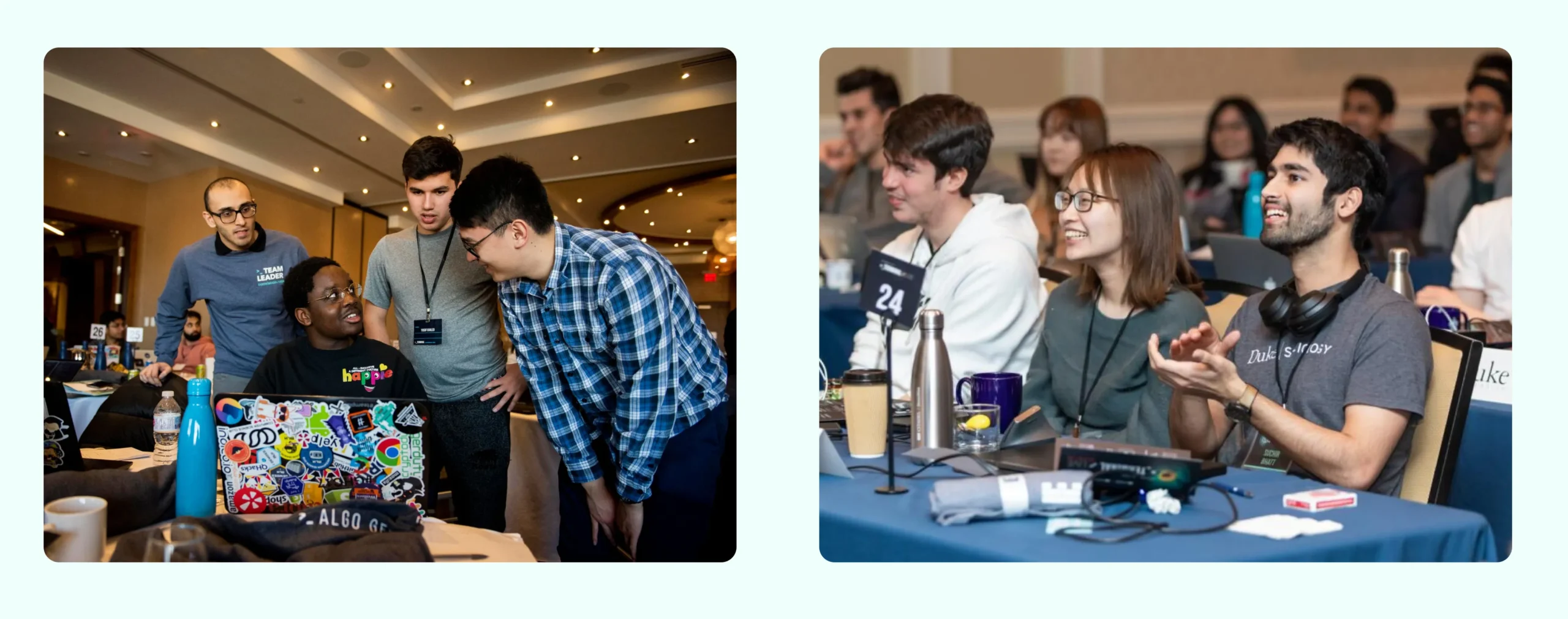
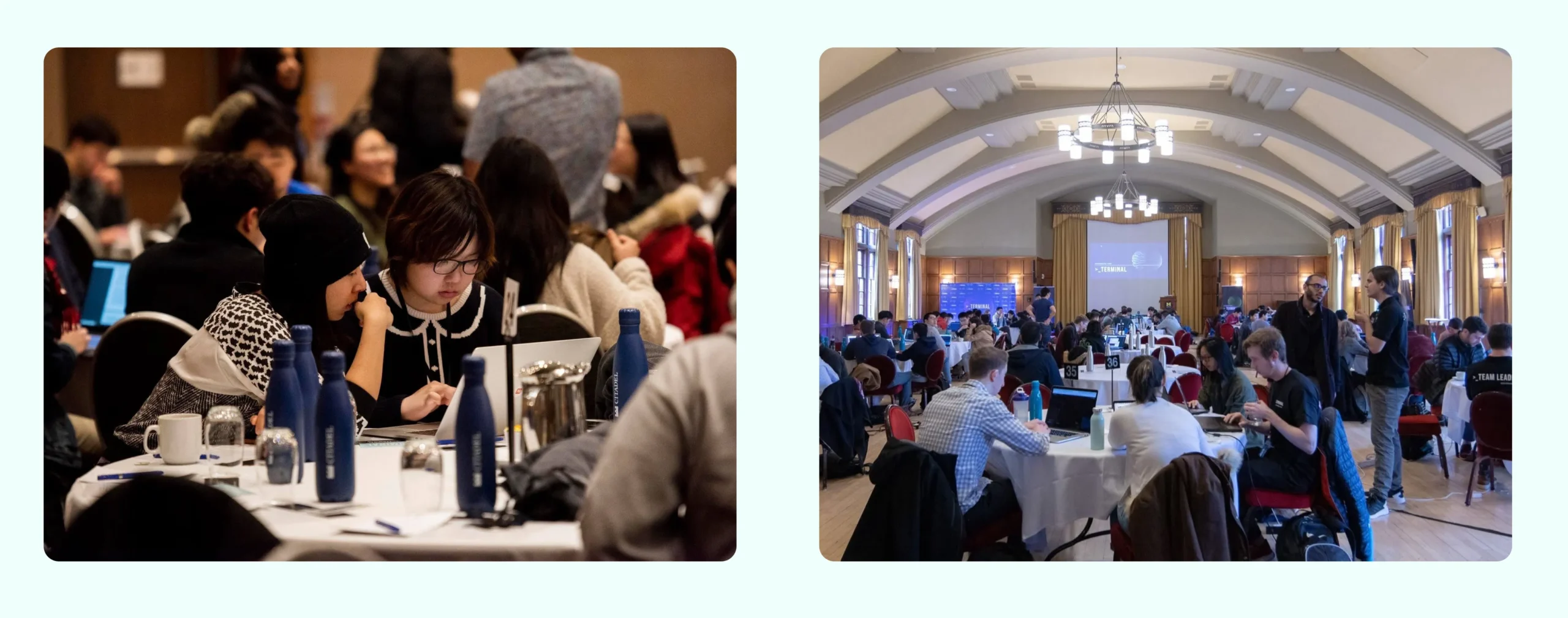
Terminal AI — Live competition
The core game was compelling, but the interface holding it together was not. Low retention became our primary signal, and a user survey revealed why: players struggled with visibility and basic readability across the gameboard. In a competitive environment where every micro-decision counts, poor legibility was a fundamental product failure.
Units blended into a dark dot grid without clear player color coding, critical game state data was scattered across the screen with faint labels, and players lacked a dedicated hub for real-time stats and actions. Contrast fell far below WCAG AA standards. Players knew the experience felt frustrating, even if they could not pinpoint the technical UX flaws. The feedback made the path forward clear: this was a visibility and information design problem, not a mechanics issue.
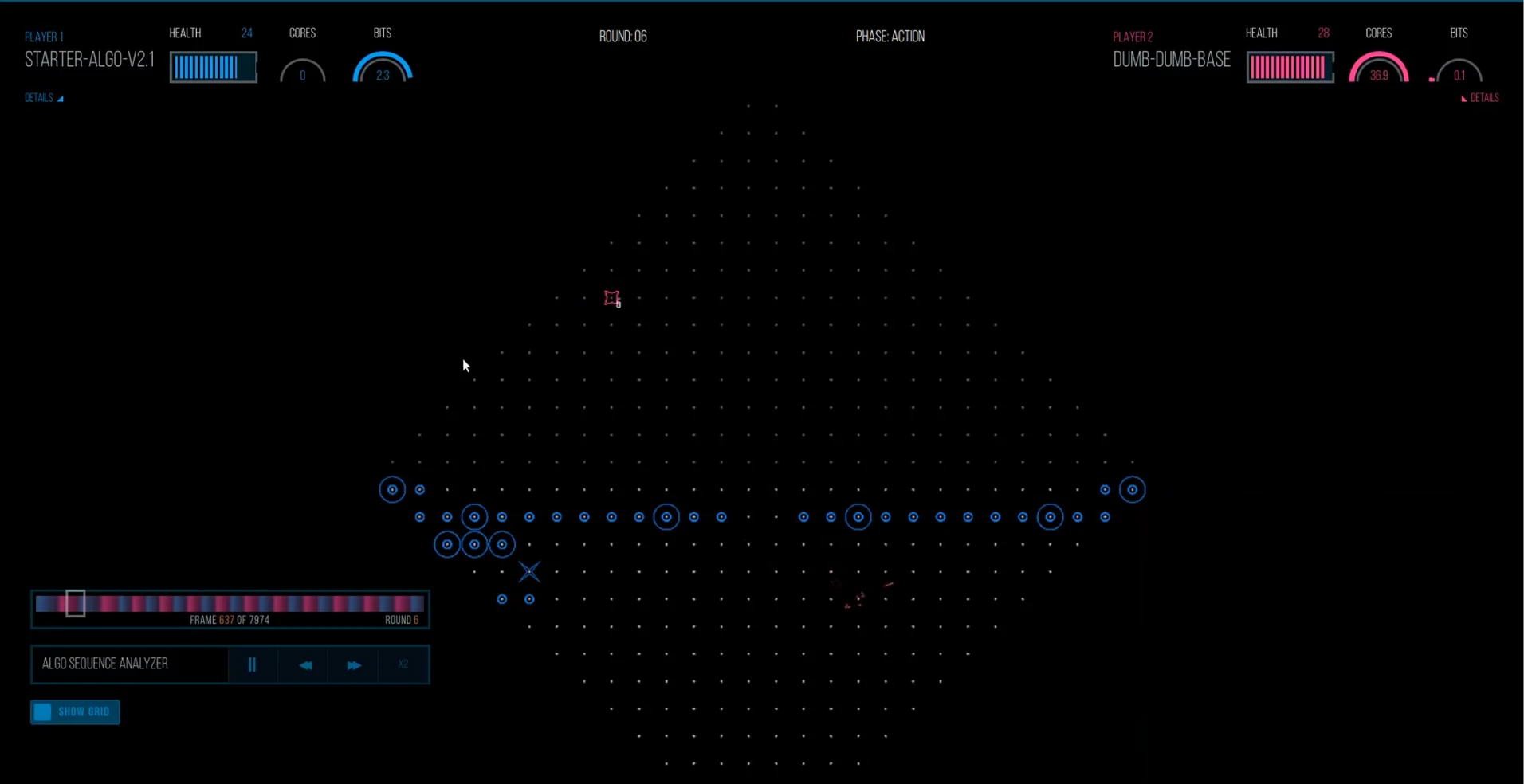
Terminal AI - Old gameboard
Research & Discovery
A player survey revealed the root cause of drop-offs: poor visibility and low contrast on the gameboard. Players were playing a game they loved, but simply couldn't see, feeling friction even if they could not name the specific UX failure.
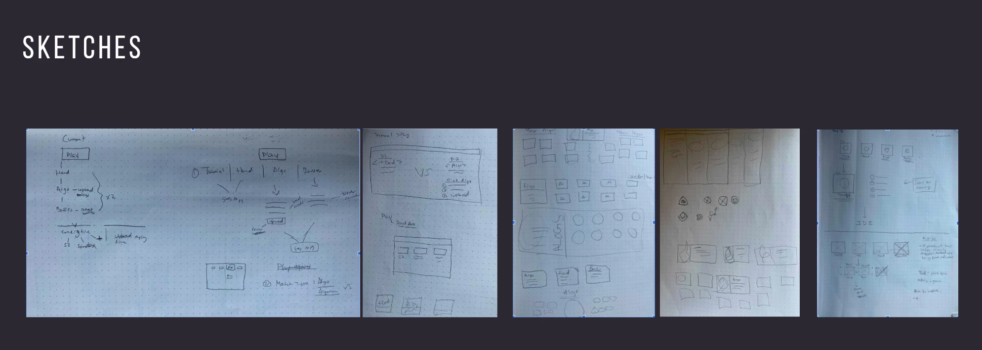
Layout Strategy & Execution
To clear the board for gameplay, I explored multiple layout directions to address a core challenge: surfacing the current round, phase, player stats, unit details, and primary actions without cluttering the board. The solution was a dedicated sidebar that houses the entire game state, leaving the grid focused purely on action. To validate the web experience, I conducted user interviews and observed players walking through new page layouts using interactive prototypes I built.
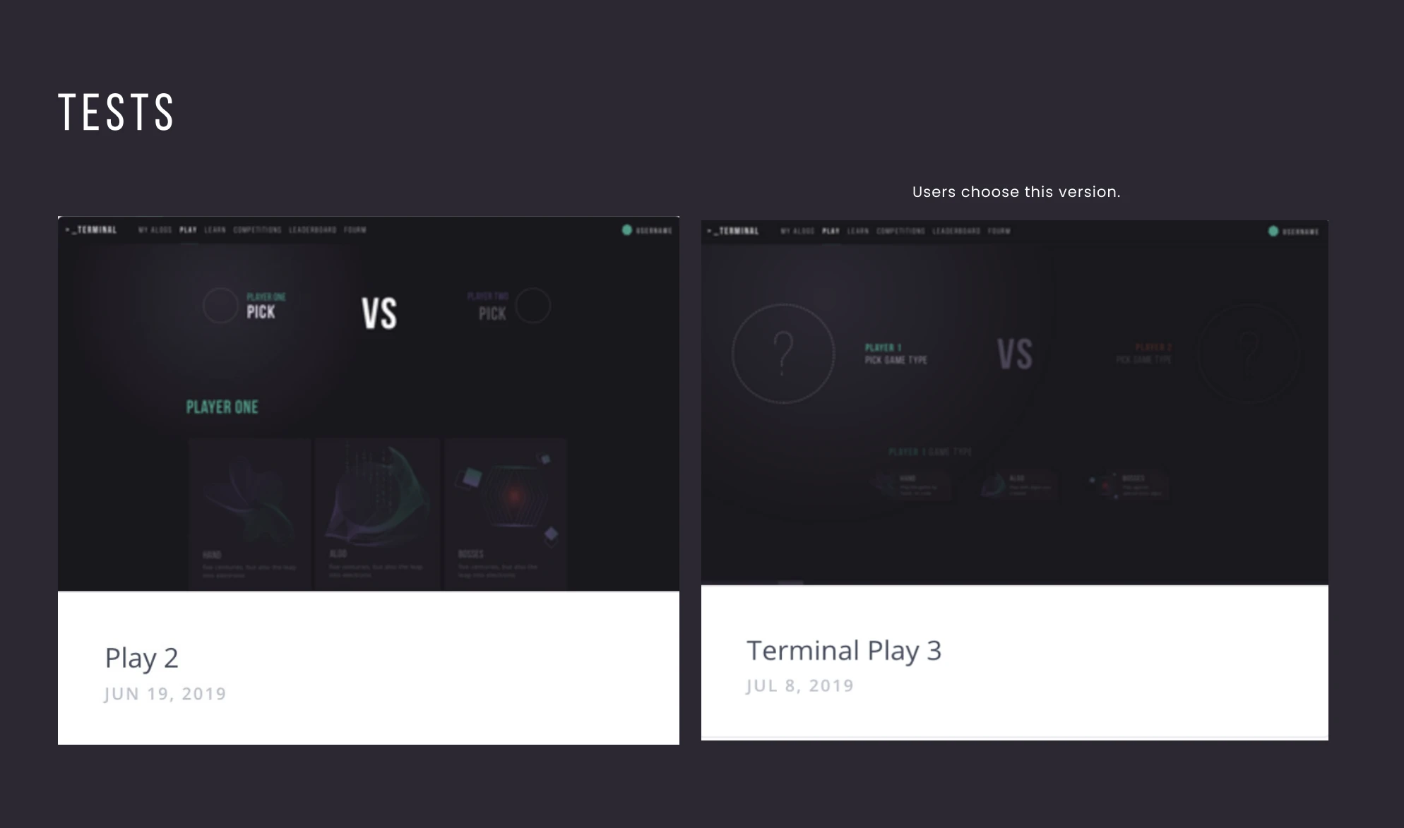
As part of our testing, I ran a preference test on the VS page layout to gather direct user feedback on different visual styles.
System Design & Longevity
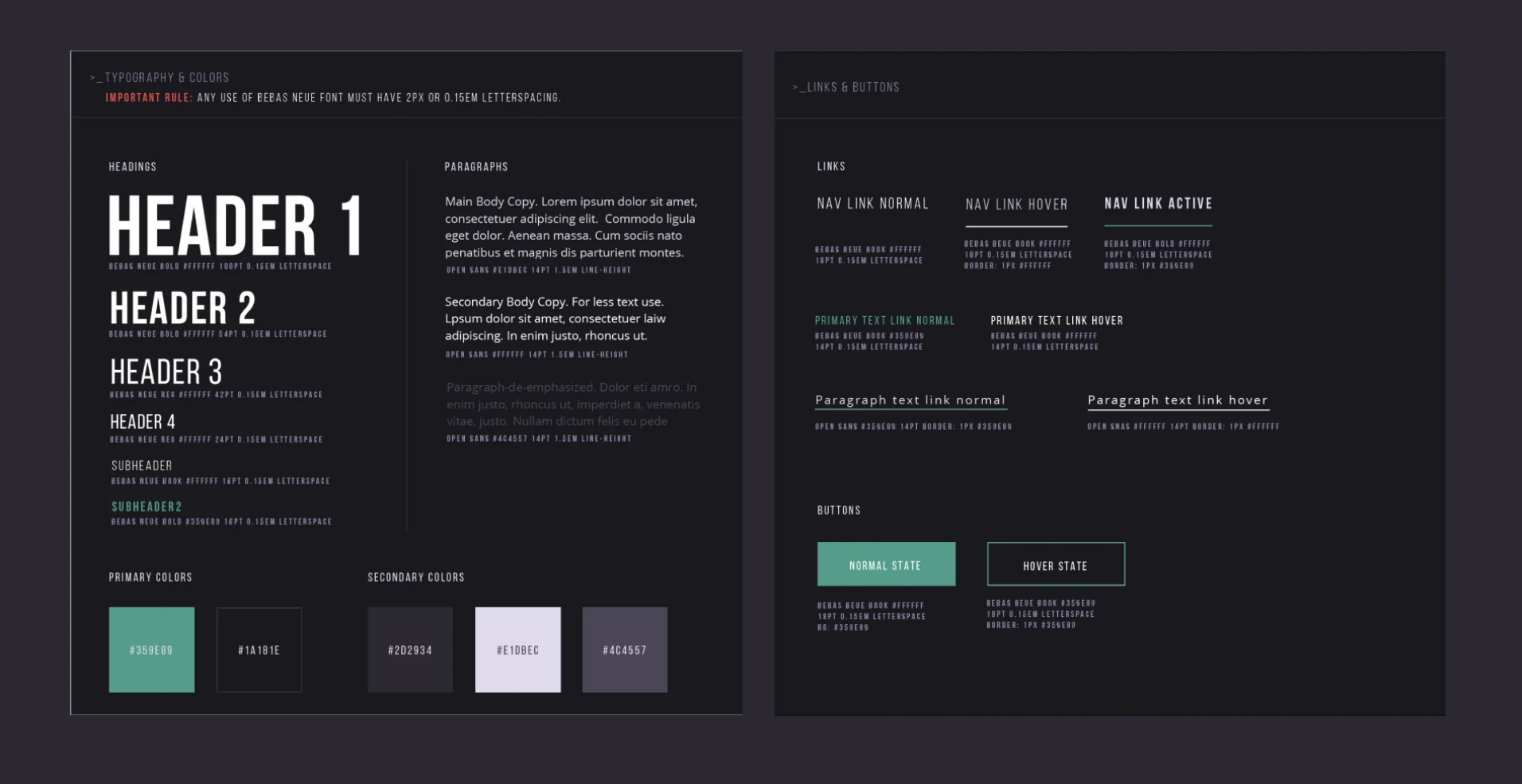
The underlying system was built to refresh season after season. Following the success of the redesign, the client doubled Terminal's release schedule from one season a year to two, relying on me to create fresh print and digital collateral for every launch. The flexible brand system I built makes these seasonal updates seamless, allowing for rapid surface refreshes with every new cycle.
Terminal taught me that a great product can still fail if users cannot see it clearly. The gameboard redesign was not about surface polish, but about making game state legible under pressure, in a high-stakes environment where every second and every pixel of information matters.
Solving for contrast and hierarchy first, before establishing the brand language, took retention from a liability to a core strength. That experience reinforced a core principle in my work: clarity must always precede craft, or the craft cannot deliver its value.
A Quick Fun Fact: Before launching a live competition, we hosted test competitions by inviting players into our office for dry runs. Watching users navigate the gameboard & Terminal in person helped us catch edge cases, uncover UX bugs, and refine critical interactions before opening the doors to full public competition.

Turning Complex Data Training into an Intuitive Student Dashboard